Commentry:
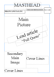
I firstly made my flatplan of the front cover, using Publisher.

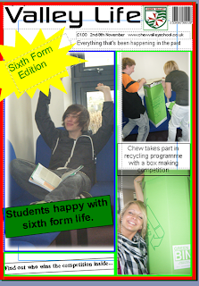
I then went on to create my front cover, but once i created the front cover following my flatplan, i realised that this was not the look i wanted my magazine to have. So i changed my front cover to look like this:

Thirdly i made my contents page:

Evaluation:
I had a few problems during my preliminary task. I had to change the front cover of my magazine to not follow my flat plan that i came up with. I also had problems loading my files with the front cover, flat plan and contents page onto my blog, as it was saved as a file and not as an image.
My magazine is aimed at the sixth form, as a type of social group, as my magazine is a special "sixth form edition" issue. The language, and style of my front cover and contents page has been made containing language and images that 6th formers would understand, and not find too un-interesting.
An institution that would sell my magazine would be one such as the school council, as my magazine is a school magazine. They would sell my magazine as it is a school based magazine, containing news and articles that are school based - such as the recycling box competition, and pupils thoughts on the new sixth form block and sixth form life that i have included in my magazine.
The audience that this issue of my magazine is aimed at is 16-18 year olds, in Chew Valley sixth form. In general, my school magazine will be aimed at all of the pupils at Chew Valley.
I have attracted my audience to the magazine, by having pupils from the sixth form featuring in the magazine through images and articles and have included interesting articles about the school in it. Hopefully, as my magazine is school based, containing school related issues and articles, it will attract more people to purchase my magazine.
Through making my magazine front cover and contents page, i have learnt how to develop photographs that i have taken, such as fading the corners of the pictures, and fading the pictures in general. I have learnt how to cut out key features of a picture easily, as firstly i used paint which took a long time, but i have found out now that i could have used photoshop to do this process quickly and easily.
After completing my Preliminary task, i have concluded that if i were to chose a still image as my main piece, i would use Photo shop as my software to create my magazine cover on rather than microsoft publisher - as people that used the photo shop programme found it was a more professional programme, and had more useful features on it. Now that i have done a practice still image piece i would feel confident in doing this again.
